
All explainers · Reading a transit network
PTAL: how a point’s public transport access level is calculated
Animation paused (reduced motion). Press play to watch.
In one sentence
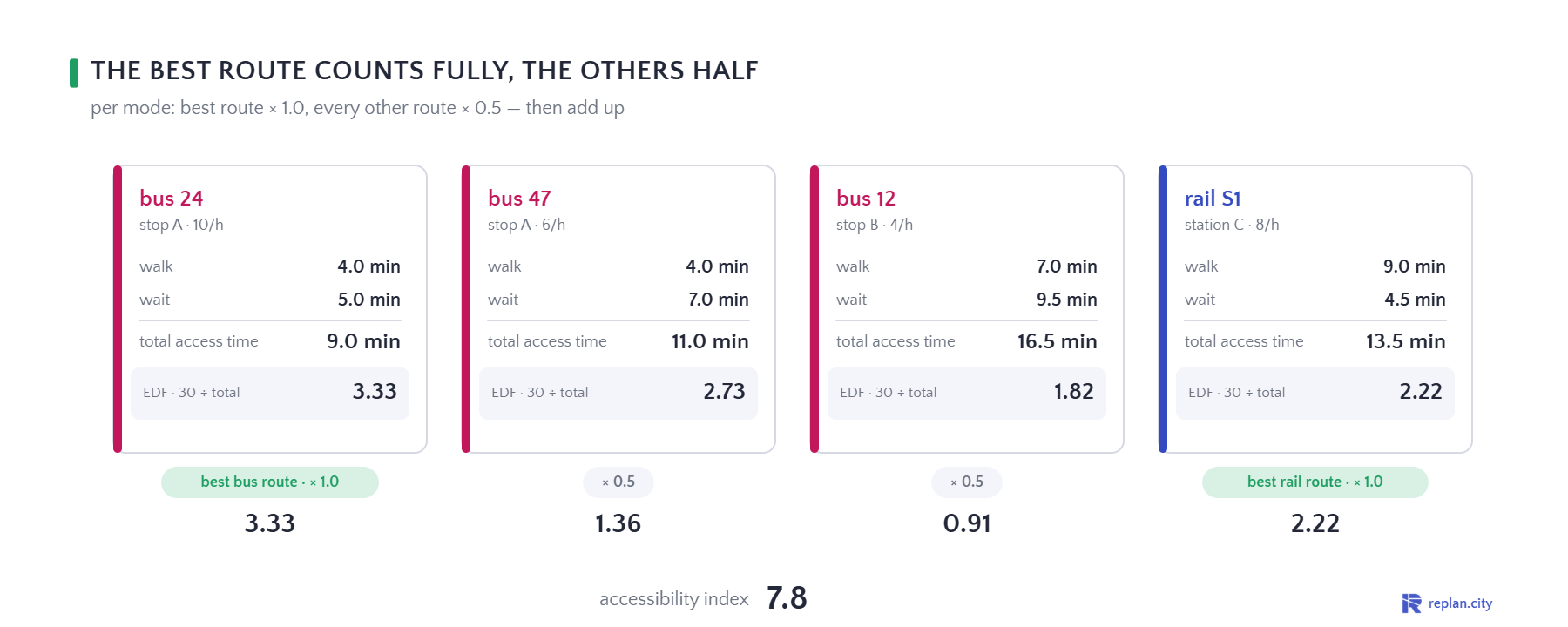
Walk to every stop within reach, add the scheduled wait, turn each route into an equivalent doorstep frequency, weight and sum — that is a PTAL band.
Why it matters
PTAL (Public Transport Accessibility Level) is Transport for London’s standard measure of how well a point is served by public transport. It counts every bus stop within 640 m and every rail station within 960 m walking distance, converts the walk into minutes at 80 m/min, and adds the scheduled wait — half the headway plus a reliability allowance of 2 minutes for bus and 0.75 minutes for rail. Each route then becomes an equivalent doorstep frequency (30 divided by the total access time); the best route per mode counts fully, all others half, and the sum is the accessibility index that is mapped to bands from 0 to 6b.
The measure is deliberately simple: it says nothing about where the services go or how long the journey takes. That is what makes it comparable across a whole city and useful for planning policy — parking standards, density, site selection — and also what it cannot tell a network planner. In the DACH region the same idea appears as ÖV-Güteklassen (stop category × walking distance), which the Swiss ARE method formalises.
Sources
- Transport for London (2010). Measuring Public Transport Accessibility Levels (PTALs) — Summary.
- Transport for London (2015). Assessing transport connectivity in London. Chapter 2, PTAL.
- Bundesamt für Raumentwicklung ARE (2022). ÖV-Güteklassen — Berechnungsmethodik. Bern (the Swiss stop-category analogue).
- Schematic illustration; distances, frequencies and the resulting band are illustrative.
In Replan
In Replan Transit the Lambda operation Service Availability scores every hexagon of the region by walking distance to the nearest stop and the frequency there — a PTAL-style map with legend, saved with the project. Replan SIM replaces the scheduled-wait assumption with waiting as it is actually simulated, and adds what PTAL leaves out: where the journey goes and how long it takes.
What you see
- 00.0One point, three stops
- 10.0Walk to each stop
- 22.0Walk + wait, route by route
- 36.0Weights and sum
- 46.0The band
- 54.0In Replan
Use this explainer
Poster (PNG) · MP4 / GIF: rendered on request
Embed: <iframe src="https://www.replan.city/explains/embed/ptal?lang=en" width="900" height="360" style="border:0;max-width:100%;aspect-ratio:5/2" loading="lazy" title="PTAL: how a point’s public transport access level is calculated"></iframe>
Paste into any page; the explainer plays as live SVG (no video file).
Licence: CC BY 4.0 — reuse freely with the line “Replan GmbH · replan.city/explains”. The Replan mark in the corner stays.
More: Transit service planning with Replan
See it on your own network
Book a demoRelated explainers
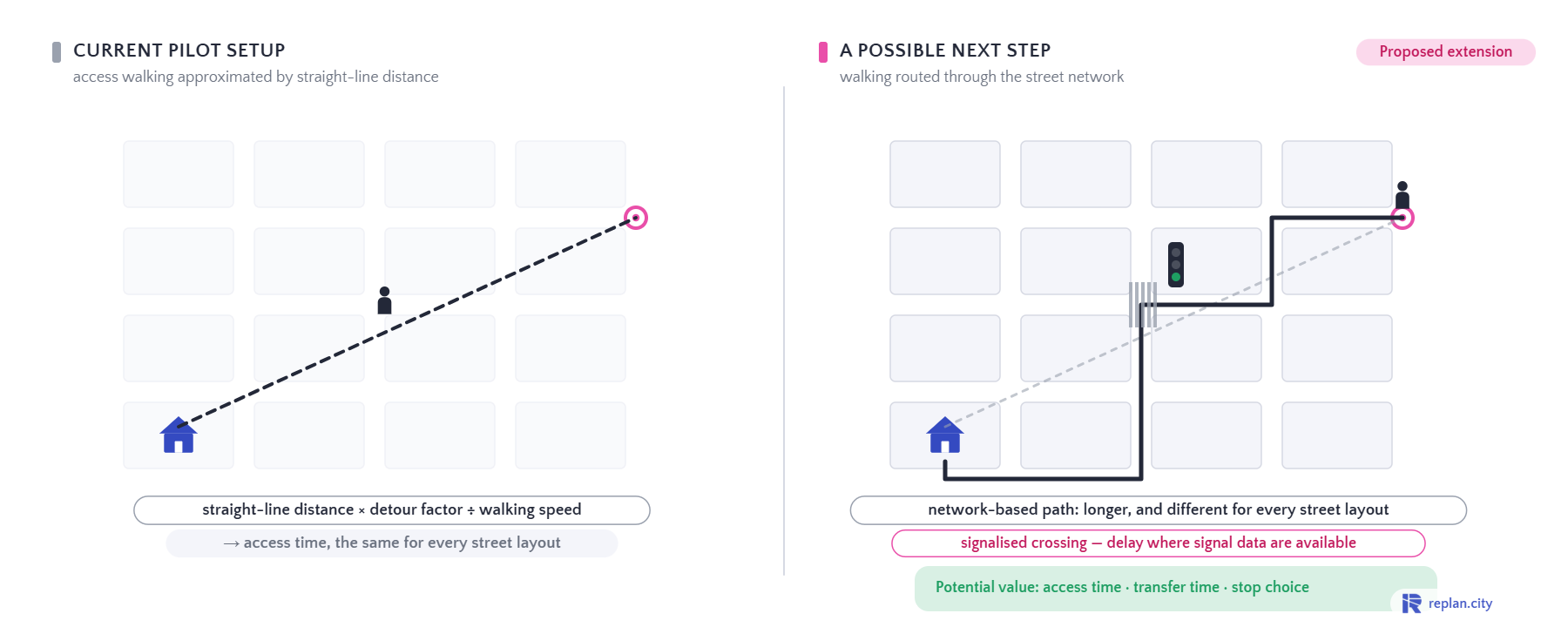
From straight-line walking to network-based walking
Potential value: access time, transfer time, stop choice.
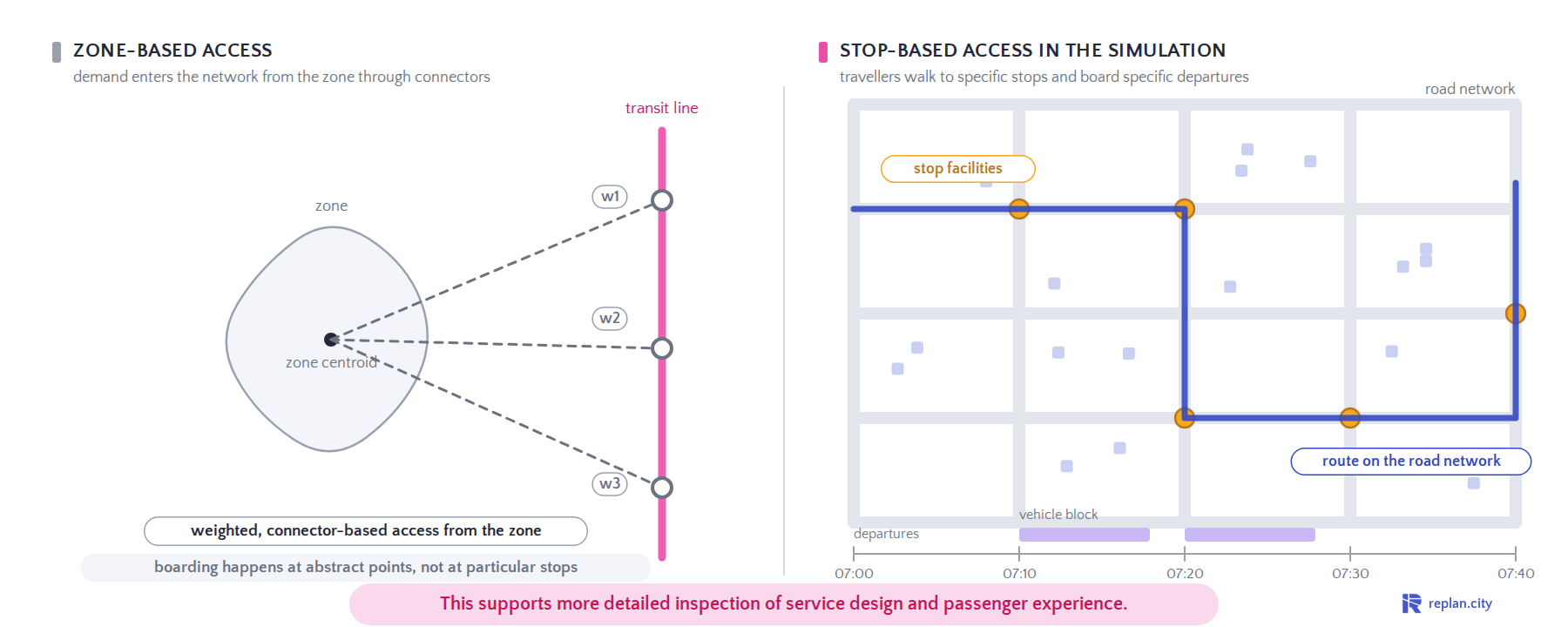
Two different ways to connect travellers to transit
This supports more detailed inspection of service design and passenger experience.
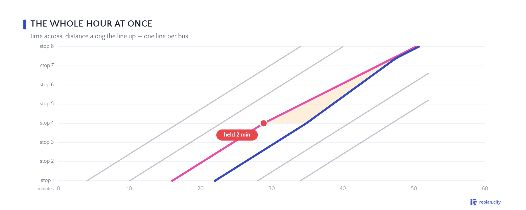
Bus bunching: why buses arrive in pairs
A late bus collects more passengers and gets later; the bus behind gets emptier and faster — until they run together.